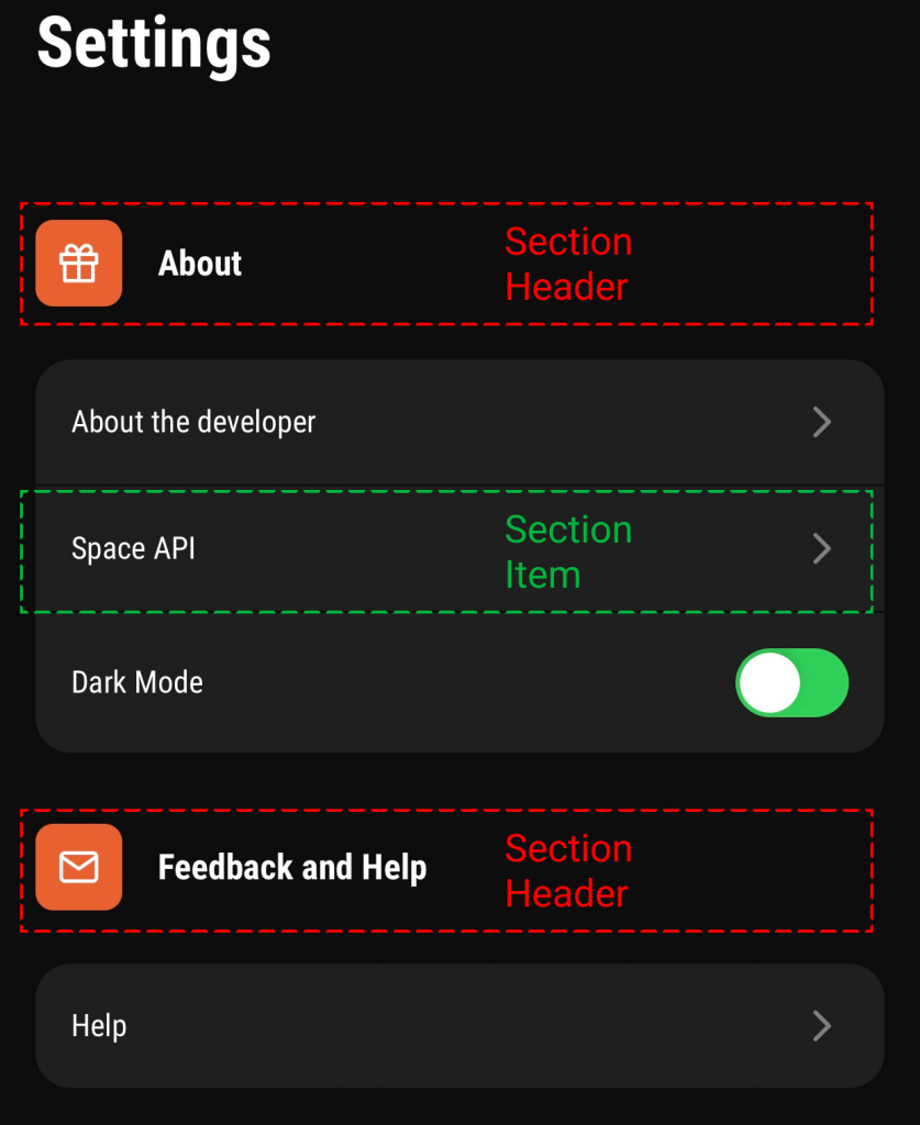
There are many libraries that provide a way to create a settings screen or list for your React Native app. I show a simple way to achieve this with basic or no dependencies.
You can find the source code here. In essence, we use the React Native SectionList for a structured or sectioned partition of the list. Alternatively, you could use a FlatList or even ScrollView if you have a small amount of items to put in your list. For imaging, you would use react-native-svg or alternatively the React Native Image. Persistence, if needed for things like a dark mode switch, could be achieved by react-native-async-storage.
The SectionList
The most interesting feature about the SectionList is its sectioned data handling. You can pass the data via sections, its function to render items via renderItem and its function to render the section header via renderSectionHeader.

Structured data is required for the Section List. Each section has a header and a bunch of items. You can define this structure for yourself. This means, you could also add elements like a header icon, as you can see in the orange box.
| interface ISettingsData = { | |
| title: string; | |
| icon: JSX.Element; | |
| data: SettingsType[]; | |
| }; | |
| type SettingsType = 'aboutMe' | 'spaceAPI' | 'help' | 'theme'; | |
| const settingsData: ISettingsData[] = [ | |
| { | |
| title: 'About', | |
| icon: ( | |
| <GiftIcon scale={0.8} /> | |
| ), | |
| data: ['aboutMe', 'spaceAPI', 'theme'], | |
| }, | |
| { | |
| title: 'Feedback and Help', | |
| icon: ( | |
| <MailIcon scale={0.8} /> | |
| ), | |
| data: ['help'], | |
| }, | |
| ]; |
When you put this data in the SectionList, when using TypeScript, types for the rendering function should be automatically inferred. This makes writing these functions much easier. It also prevents possible errors by enforcing types on sections, for example to require an array type.
| import * as RN from 'react-native'; | |
| export const SettingsList = () => { | |
| return ( | |
| <RN.SectionList | |
| sections={settingsData} | |
| style={{ flex: 1, width: '100%', marginTop: 24 }} | |
| showsVerticalScrollIndicator={false} | |
| bounces={false} | |
| onEndReachedThreshold={0.5} | |
| ItemSeparatorComponent={StyledSearchItemSeparator} | |
| keyExtractor={(it) => it} | |
| renderItem={renderItem} | |
| renderSectionHeader={renderSectionHeader} | |
| /> | |
| ); | |
| } |
The Section Item and Header
When looking closely, you may have also noticed that the Section Item has rounded borders, if they are first or last in the list. This can be achieved by comparing the current render index against the sections data that you put into the SectionList.
| const renderItem = props => { | |
| const isFirstElement = props.index === 0; | |
| const isLastElement = props.index === props.section.data.length - 1; | |
| return ( | |
| <SettingsListItem | |
| item={props.item} | |
| isFirstElement={isFirstElement} | |
| isLastElement={isLastElement} | |
| /> | |
| ); | |
| } |
The Section Header is also a rather simple component. It needs to render the title and icon that you specified.
| const renderSectionHeader = ({ section: { title, icon } }) => { | |
| return ( | |
| <SettingsListSectionHeader icon={icon} title={title} /> | |
| ); | |
| } |